I started off this series of experiments by thinking about myself, how i see myself and how i choose to be seen, how do i identify myself?
I started thinking this when i was doing my report on Art Wolfe, looking at his human canvas photographs i wanted to do something with body painting, and i am working on that. But i wanted to try out digital editing first, i enjoy this kind of art and wanted to experiment with it.
I started by taking a picture of myself, nothing fancy just me in front of a white background.


I was not as keen on these as i was with my other ones, so i decided to start again taking the same idea but adding my hands in to see if i could give it a different feel.


 I then did the same as i did with the first image, but i felt the hands in the way helped get the message across and i felt a good connection with them, i felt like they really expressed how i feel about myself.


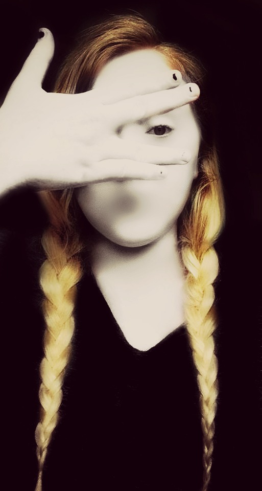
 This is my favorite image, i think it expresses that i feel i can blend into a background if i want, but also stand out when i want. i liked the eye being open and i kept it while editing because i liked one the contrast in the blank face with the open eye and also it is quite symbolic, in the way i find it hard to talk about myself or how i view myself and sometimes my opinion, but that i am quite visual with how others present themselves, that i am very aware of it in others but not myself.
I find it quite hard to analyse myself and think about what makes me me, but i think this is a good start, i really enjoyed editing them, and found it a lot of fun having an idea behind it, and it being mine. I felt a lot more relaxed about how it should look, i guess because it was about me and my image and ideas.
I started thinking this when i was doing my report on Art Wolfe, looking at his human canvas photographs i wanted to do something with body painting, and i am working on that. But i wanted to try out digital editing first, i enjoy this kind of art and wanted to experiment with it.
I started by taking a picture of myself, nothing fancy just me in front of a white background.

I have always thought about myself as someone who struggles with identity, in some ways i feel like i stand out but in other ways i feel like i can blend into a background or a crowd when i want too. i kept this thought going by blurring out my face in the photograph.

I then decided to change the face and background white to match each other, i liked the way this image looked and felt like it expressed my feelings of no identity. but not strong enough about hiding into the background.

I decided to try and change the face and background to a wall print to try and get my message across

I liked it but decided to try out some different backgrounds.


i really liked these two but i felt the grey top was in the way, i decided to fill them in black and see if that would look better


I find it quite hard to analyse myself and think about what makes me me, but i think this is a good start, i really enjoyed editing them, and found it a lot of fun having an idea behind it, and it being mine. I felt a lot more relaxed about how it should look, i guess because it was about me and my image and ideas.
good read and images
ReplyDelete