Alayne Spafford
https://www.alaynespafford.com/
Insta: @alayne_spafford
Working in different mediums and work in series, Spafford's large canvases begin with collage. She adds the collage elements with historical, personal or things that exist or are used or enjoyed for only a short time.She sometimes uses things like old newspaper, vintage wall paper, old crochet work done by her mother and other collected items.


- Howard Hodgkin


Hodgkin’s had a huge collection of Indian paintings and drawings It comprises over 115 works, including many from the Mughal period (c. 1550–1850).


Wassily Kandinsky
 Kandinsky is generally credited as the pioneer of abstract art. I wanted to look at someone who is a little different that the two above. Kandinsky's work is although still abstracted more clean, and there is an element of mathematical derision making in his paintings.
Kandinsky considered compositions as main declarations of his artistic ideas. "From the very outset," the artist wrote, "that one word "composition" sounded to me like a prayer."

In Kandinsky's work, colour is its soul. In his books, he described his own perspective on how colours interacted with each other.

Joan Miró
(20 April 1893- 25 December 1983)


In his work the Elements of line or colour are so unique and really interesting. In his large works he uses space and composition to create a universe that is completely absorbing.
I found this seires of paintings - Triptych Bleu I, II, III
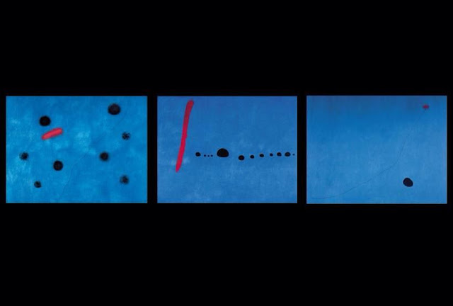
Miró completed these in 1961, at this point his career was well established and he saw this triptych as a summary of his works up to this point.As his career grew from busy landscapes/ portraits to abstracted paintings that were very minimal and using primary colors, the style in which Bleu II was created. I feel you can really see his work of automatic paining or the subconscious in Bleu II. Bleu I and Bleu III are nearly identical to Bleu II with exactly the same backgrounds of matching color and simple lines and shapes.
Edwin Parker "Cy" Twombly Jr.
Twombly's paintings are usually large-scale and very free drawn on top of gray, tan, or off-white colors.
https://www.alaynespafford.com/
Insta: @alayne_spafford
Working in different mediums and work in series, Spafford's large canvases begin with collage. She adds the collage elements with historical, personal or things that exist or are used or enjoyed for only a short time.She sometimes uses things like old newspaper, vintage wall paper, old crochet work done by her mother and other collected items.


After the collage she adds a quick wash of random colors, with layers built up in oil, using a balance of colour that forms organically.My favorite of her works is her sketchbook work as well as her smaller raw edged canvases.These are looser and incorporate more mixed media like pen, spray paint and pencil.


Her in sketch books start with things that inspire her. She sketches and removes things stuck down in old sketch books. These leave fragments of where the glue once was, she then uses These fragments as a starting point for new studies.
With her Drawing, painting and collaging she starts Building layers on top of the remains of glue. She then comes back to them days later when paint has dried, or years later if she feels inspiration.
I was instantly drawn to her work as i find it so interesting. I love her use of colour which she says forms organically and she has loved colour since she was a child. I am interested in how she uses texture but also how she uses found objects to create the texture giving her work a lot of depth.
Sir Gordon Howard Eliot Hodgkin
(6 August 1932 – 9 March 2017)
https://howard-hodgkin.com/
“A lot of people… are afraid of pictures which have visible emotions in them. They feel calmer in front of pictures which are placid”
Howard Hodgkin was a British painter and print maker. His work is most often associated with abstraction. His work explores painting as a sort of language as well as a form of visual expression. His work is formed with gestures, sweeping motion, textures, using of light and colour.

His more smaller paintings appear more polished and while beautiful his larger works really interests me as it seems almost theatrical with the texture, line and colours used.

His work captures the idea of Self awareness, spontaneity and reflection. His work can take years to come to completion. What i love about this work as it can almost appear causal,effortless when in fact every brush stroke is deliberate and thought out thoroughly. They also show a strong relationship between hand, eye and memory that creates such an emotional and raw result.
His work is hugely inspired by Indian painting. Speaking in 2016, Howard Hodgkin said:
‘I fell in love with Indian art when I was at school, thanks to the enterprising art master, Wilfrid Blunt. I longed to visit India, but only managed to do so in my early thirties. It proved a revelation. It changed my way of thinking and, probably, the way I paint".


To me his work explores so much raw emotion that i find really beautiful and interesting. I really like his relationship between the paint and the canvas. I love how much it says and expresses through the application of paint and is definitely something i will explore in my practical work.
Wassily Kandinsky
(1866–1944)
https://www.wassilykandinsky.net/
"There is no must in art because art is free."
- wassily kandinsky
 Kandinsky is generally credited as the pioneer of abstract art. I wanted to look at someone who is a little different that the two above. Kandinsky's work is although still abstracted more clean, and there is an element of mathematical derision making in his paintings.
His first composition was in 1910, the last one from 1939. These Compositions are a common
thread running through all the work of Kandinsky.
Kandinsky was a synaesthete, i.e. he could ‘hear colours’ and ‘see sounds.’

(20 April 1893- 25 December 1983)
"I try to apply colors like words that shape poems, like notes that shape music."
- Joan Miro
Joan Miró was a Spanish painter, sculptor, and ceramicist. his work has been interpreted as Surrealism he created work using the idea of the subconscious mind, specifically automatic painting. Inspired by Freud’s study's on revealing the unconscious mind, Joan Miro and Max Ernst created automatic paintings. This free way of creating art led to simplified organic shapes.

I was interested in looking at Miro's paintings because of his automatic painting technique. I like the idea of letting things come to you organically or on a subconscious level. I found a quote of him on the Tate web sight saying ‘for me a form is never something abstract; it is always a sign of something’ (Miró 1987, p.207).
I like that very much. Again i find looking at him interesting because of his relationship with paint.
As a child he was used to not having enough to eat because of this he had hallucinations
"I did not paint what I saw in a dream, but that which hunger was producing: These states of trance allowed for transition, transformation. Later, he practiced fasting "to see better "
I find this interesting to think about when viewing his work and makes me consider how work can transform and progress.


I found this seires of paintings - Triptych Bleu I, II, III

I found these paintings just so beautiful.
I found these so interesting and i thought the huge amounts of blue with the stroke of red just worked so well and kept my gaze for so long.
(April 25, 1928 – July 5, 2011)
Twombly often quoted poets such as Stéphane Mallarmé, Rainer Maria Rilke and John Keats, as well as classical myths and allegories in his works. Examples of this are his Apollo.


Comments
Post a Comment