In my first year i looked at a photographer called Art Wolfe who is known for his nature photographs for the covers of national geographic.
His work is talked about a lot, and i did another post on this before, about how it is digitally manipulated to create more appealing textures, shapes and colours.

His work is talked about a lot, and i did another post on this before, about how it is digitally manipulated to create more appealing textures, shapes and colours.

I wanted to look at his other work this time, a series he did called Human canvas project. This interested me as i have an interest in body painting as well and themes that talk about social norms and identity.


These works are inspired by Wolfe's travels around the world, he uses naked human form as a comment on social standard around the world as well as tribal marking that are used during celebrations and it is also connected to his work before called "Vanishing act" a series of images of animals that use camouflage in nature.
I can see that in these images and i like the unusual camera angles. I love the use of black and white also.
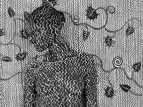
I stared by just doing something quite simple in black and white and started playing around with the image.


I was ok with it, but i wished i had a model to work on, i decided to play around with the images positions.


I forgot how much i loved body painting and i want to defiantly use it for my photography unit.I wanted to start thinking about using it for my digital collages.


These works are inspired by Wolfe's travels around the world, he uses naked human form as a comment on social standard around the world as well as tribal marking that are used during celebrations and it is also connected to his work before called "Vanishing act" a series of images of animals that use camouflage in nature.
I can see that in these images and i like the unusual camera angles. I love the use of black and white also.
The first thing i notice about these is that he is not trying to match the background completely. A few artists that use this idea tend to make it almost impossible for you to see the figure in a very clever way. Art Wolfe is not doing that. The figure is still the main focus, it is still very obvious that it there. The Positions of the body is very interesting as well, he is not only using line, texture and tones on the body and the background he is putting the bodies into interesting positions making them patterns in themselves.
I stared by just doing something quite simple in black and white and started playing around with the image.


I was ok with it, but i wished i had a model to work on, i decided to play around with the images positions.


I forgot how much i loved body painting and i want to defiantly use it for my photography unit.I wanted to start thinking about using it for my digital collages.
Sources:
https://humancanvasproject.com/
https://artwolfe.com/about/
https://store.artwolfe.com/product/vanishing-act/
Comments
Post a Comment