PART 1
For my art & design project my chosen theme is home. I was inspired to have this as my theme because of the personal development program i did back in June 2017.
Just before i traveled out to Venice, for this development program, I had just moved out of the home i shared with my Ex partners for 4 years. After a brief time at my parents i ended up moving to where i live now, in Galashiels. I was here for about a week before i flew out.
Wandering the streets of Venice, alone, it was a big change for me in my mind set because i was seeing myself as more of a singular person.
About 2 weeks in i got pretty homesick, i missed my cats as sad as that is. I realized the place i missed was not my home anymore. It got my thinking about the concept of home... If i asked where are you from?, the answer might be different than if i asked you where is home? Is it a place?, a Country?, a town?, where you grew up?, where your family is?, where your friends are?, where you have been the longest? or maybe where you have a sense of community?
To me, it felt like something that is Fleeting. This idea got me thinking about 'home' in a more abstracted way...The idea of home being something that constructs and deconstructs around you, something that has depth, has layers....
I have been intensely enjoying creating collages for my other units, and i thought this would a perfect way to carry on my experimentation with the concept of collage as well as, i feel, it is a perfect medium for this theme.
I wanted start by looking at Artists that use collage. ( some done already in blog posts for other units).
Picasso and Georges Braque
As i know cubism is split into two phases.In the second phase, synthetic cubism, artists started adding texture and patterns to their paintings. Collage newspapers, stamps, patterned paper ect. As far as i can see this was the first step of collage. At the time this i guess this was a break from hundreds of years of Western painting tradition and was very different for anything people had seen before.


I have been experimenting a lot with collage lately but i liked the idea of using found objects, like they did. Things that reminded me of 'Home' as growing up. When i say home as growing up, i mean things that give me a comforting feeling, or that remind me of when i was younger. I am starting with this because i feel like exploring different ideas of what home is will help me with a structure to my investigation.

I then decided to use images that reminded me of home, still in the idea of home being from childhood.

Eveyday after school (primary) me and my sister would go to my granny and granddad's house where my sister would have soup and i would have a glass of milk. I remember playing with her necklaces.


I liked these as a 3 and thought about putting them together some how. I then stumbled across a feature on Photoshop called motion that allows you to add layers and turn them into moving images.
I decided i would like to try this out in a slightly different way... i wanted to cut these shapes into paper and then shine light through them, capturing the shadow.
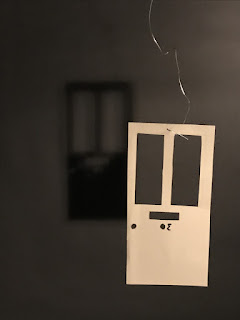
I stared with something really simple, my childhood house door.


For my art & design project my chosen theme is home. I was inspired to have this as my theme because of the personal development program i did back in June 2017.
Just before i traveled out to Venice, for this development program, I had just moved out of the home i shared with my Ex partners for 4 years. After a brief time at my parents i ended up moving to where i live now, in Galashiels. I was here for about a week before i flew out.
Wandering the streets of Venice, alone, it was a big change for me in my mind set because i was seeing myself as more of a singular person.
About 2 weeks in i got pretty homesick, i missed my cats as sad as that is. I realized the place i missed was not my home anymore. It got my thinking about the concept of home... If i asked where are you from?, the answer might be different than if i asked you where is home? Is it a place?, a Country?, a town?, where you grew up?, where your family is?, where your friends are?, where you have been the longest? or maybe where you have a sense of community?
To me, it felt like something that is Fleeting. This idea got me thinking about 'home' in a more abstracted way...The idea of home being something that constructs and deconstructs around you, something that has depth, has layers....
I have been intensely enjoying creating collages for my other units, and i thought this would a perfect way to carry on my experimentation with the concept of collage as well as, i feel, it is a perfect medium for this theme.
I wanted start by looking at Artists that use collage. ( some done already in blog posts for other units).
Picasso and Georges Braque
As i know cubism is split into two phases.In the second phase, synthetic cubism, artists started adding texture and patterns to their paintings. Collage newspapers, stamps, patterned paper ect. As far as i can see this was the first step of collage. At the time this i guess this was a break from hundreds of years of Western painting tradition and was very different for anything people had seen before.


 |
| Juan Gris- The sunblind |
I have been experimenting a lot with collage lately but i liked the idea of using found objects, like they did. Things that reminded me of 'Home' as growing up. When i say home as growing up, i mean things that give me a comforting feeling, or that remind me of when i was younger. I am starting with this because i feel like exploring different ideas of what home is will help me with a structure to my investigation.

I then decided to use images that reminded me of home, still in the idea of home being from childhood.

Eveyday after school (primary) me and my sister would go to my granny and granddad's house where my sister would have soup and i would have a glass of milk. I remember playing with her necklaces.


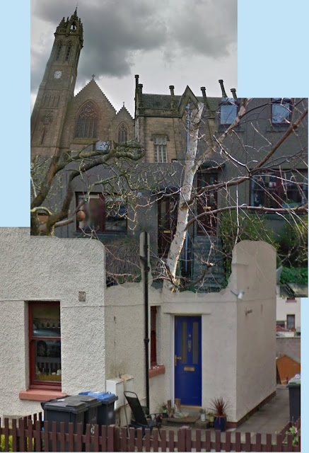
I remember playing all day around my home town Peebles. At my family home we would compete to grow sunflowers. There was always tomatoes growing on the window and we would drink tea all day.

This is a mix of my grans house, bottom, my family home, middle and the town church, top.

I then wanted to look at Matisse as inspiration on how i could possibly continue this idea. Matisse's work with collage were central to his art as he struggled to paint in his old age, he would have assistants paint his paper for him before he would cut them out with a large pair of scissors.


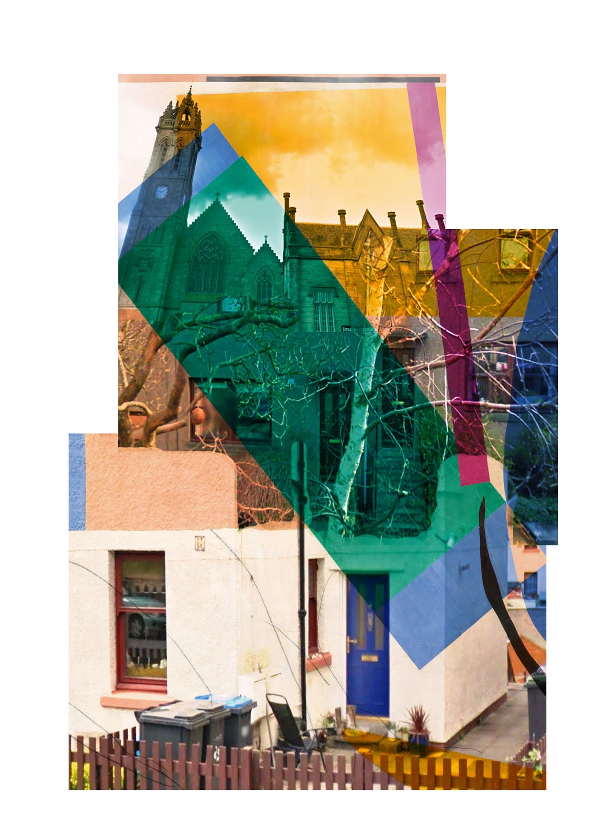
So i decided to make layers over the top of the house collage, very slightly at first and seeing where it went.

I then wanted to play around a bit with the idea of cutouts and also a bit more colour.

I liked these as a 3 and thought about putting them together some how. I then stumbled across a feature on Photoshop called motion that allows you to add layers and turn them into moving images.
I decided i would like to try this out in a slightly different way... i wanted to cut these shapes into paper and then shine light through them, capturing the shadow.
I stared with something really simple, my childhood house door.


while i was in the studio at collage i caught a glimpse of my shadow and i really liked the way it was casting on the backdrop so i caught a few photos.
I then ended up playing around and making a few collages/ repeat patterns on Photoshop.


I am letting the process of this unit come naturally to me through experimenting which i am enjoying very much.
Comments
Post a Comment