For my painting unit i decided to use the theme interior. I wanted to focus on self portraits. I wanted to create portraits that expressed my interior. Mood, feeling and what i see inside myself.
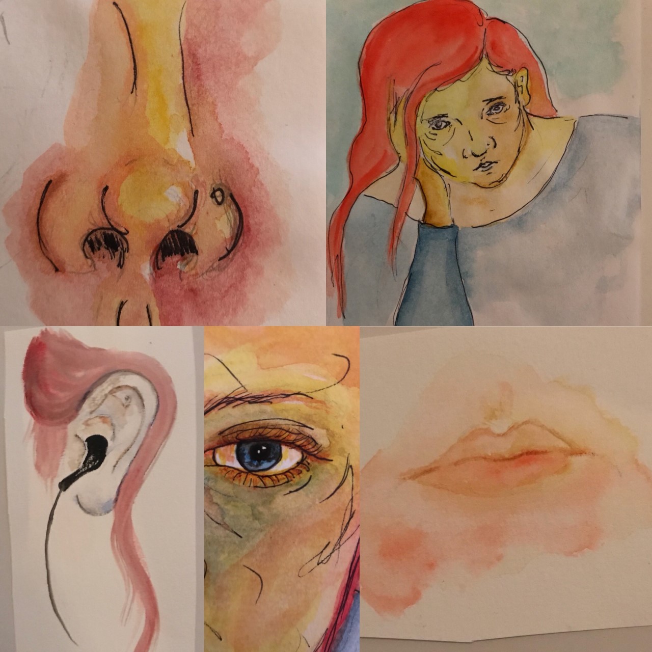
I started by looking at what we had learnt in the first stage of this unit, colour theory. I tried using different colour combinations on just simple self portraits. I have always liked a cooler pallet more so, as i love cool blues. But i did try to do warmer paintings as well as complimentary and triad colours.I found a big pull towards using watercolours and i wanted to take this time to practise.

After experimenting with colour i decided that what i would like to focus on was collage, i had been enjoying it so much with my other units i thought it would be a good way to keep the interest in my work.
For my other units i looked at collage artists and posted blogs but i also kept them, and what i had learnt, in mind while doing this unit.
For my other units i looked at collage artists and posted blogs but i also kept them, and what i had learnt, in mind while doing this unit.


I felt like tearing up the paintings and sticking them down was so messy i just didn't feel satisfied with what i was making ... I wanted it to look cleaner.
I also looked at Matese's cut outs, something he is very well known for and used his work for my own inspiration...
 |
| Blue nude |
 |
| The Snail |
 |
| The Sheaf |
What i love about these is the simplicity of them, but also how sophisticated they are. The colour of them is beautiful,i always stayed away from colour because i didn't know much about it but after learning more i wanted to use it.
I decided to start cutting up my paintings and collage them together.


I learnt that i have no problem in destroying my work, i quite happily cut up paintings i had spend time on. I did use photocopies but that was mainly to help with time when experimenting with composition.
I really enjoyed using the colored back ground as they gave it a little pop of colour. I liked doing this so i kept going. I liked the idea of having something as a collage that still expressed my face. I liked playing around with scale.I took inspiration from some of Picasso's paintings as i liked his use of colour, scale and line.
 |
| Weeping Woman |
 |
| Les Trois Danseuses |
 |
| Head of Woman |
 |
| Bust of Woman |
I wanted to combine what i had learnt in colour theory, with Matese's cut outs and Picasso's structure he used on faces....


Eventually this lead me to creating my final images, i wanted to make a small series of 4 collage paintings.

Over all i would say i did not enjoy this unit as much as others, i found it hard to connect with the work, but i understand the importance of perseverance in work, even when you are not enjoying it. I did start to enjoy it more when i decided to use my paintings in collages. I have a better understanding of how i work, and also what a painting can be. I tend to be quite harsh on myself when producing work, i could have made that better, or done more. But i feel for this unit i came to a natural conclusion and i am happy with the finished works.
Comments
Post a Comment