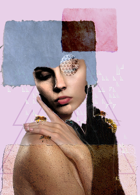
Contextual Studies - Collages


Because of the weather i was unable to carry on with my physical collages as the college was closed and i had no access to a printer, i decided to carry on with creating digital collages. 

I have been looking at Dada / Surrealism collages and using artists from both to help inspire collages. I found a pull more towards the idea of surrealism collages, using elements of dreams or fantasy as inspiration.

I really enjoyed making collages that combined pre 1960 photography and more modern images. I started by looking through images and finding inspiration from it, then working on top of that.  


I try to let my imagination go as much as i can with these, i think about position of up and down, sky, space, sea, land and people and the role they play around us, i then try to move it around, creating layers that make images.

It is ,in a way, a lot easier to make physical collages because of the cutting and cropping. if i find an image i want to use cropping it on photoshop can be tricky compared to printing it out and cutting it myself...

In saying that it is obviously easier to create digital collages when it comes to scale, colour and materials...


Some of these images don't work at all because they are stretched out, and that has to do with my settings on my at home computer the way my desktop was set up to fit in my monitor, its something i didn't notice until i switched back to my laptop... 


This one i was trying to create something that looked more like a physical collage, i was trying to create a sense of depth. I also used images of scrapped/ torn paper. I like the outcome of this image it seems more seamless than the others. 


Max Ernst 's collages are very seamless, the cutting and sticking skill is very good.  I like his collages because of this. The images you are looking at look almost real. They are completely strange but they look like they are meant to look that way. Mine can be very jagged, even digitally i struggle to make things look like they are correct so to speak. 


These collages are a series of images put into a book called a week of kindness. it is made of 182 collages using illustrations from Victorian comics, books and novels. 


I liked the idea of creating work from comics...Iand making changes to it, i started by taking images from the walking dead comic books.


I really like these but i what i liked about Ernst's collages is that they were so smooth, i decided to try them in black and white and see if they looked any better like that. 


I then wanted to look at how he uses animals in his work with humans and wanted to create some collages more in my style with animals and figures. For fun. 


This one is by far my favorite image, i was looking more at Dada collages and i actually liked the introduction of word.  Its something i did not think of before. 

I swing more towards surrealism as a base for collage because i find it more satisfying, cleaner in a way than Dada. 

I wanted to play with that idea a little....


I really enjoy making these digital collages, like i said i could make them all day, i would love to print them off on a large scale as i think they would look so interesting... i was planning to do some bigger scale physical collages but obviously i couldn't...

I find there is something about cutting and sticking physical images that i really enjoy i feel a bigger connection with the work and i am not as picky about size.... I find it very therapeutic to make these.

Comments

Popular posts from this blog

Alice Potter

. Digital Media . Illustration . Surface Pattern . Alice Potter   I decided to start my research with Alice Potter. I was interested in Alice Potter's work because it is very different to what i usually look at.  Potter is a London based freelance illustrator and children's wear print designer. Design is something i am not sure i have an eye for, i do appreciate it but i don't tend to find myself attracted to it, or give it as much thought as i probably should. http://alicepotter.co.uk https://www.etsy.com/uk/shop/AlicePotter I love the colours in this one above, i like how simple it is, but it still translates as an apple. I like the dot print i think it adds a kind of sweetness to the design as well as add something to the flatness of it. I really like these, i love how happy they look because of the use of colour.  Potter draws her work out in her sketch book and then moves onto illustrator where she uses the pen ...

Photography : Rommert Boonstra & Laurie Simmons

For photography i wanted to look at artists who use models or staged worlds for their photography because its not something i looked into previous years. From moodel i came across Rommert Boonstra. He is a photographer, poet and theater director. He also taught photography at several art academies.He is well known for his Staged photography and he has Four books are published about his photo works. He uses everyday objects to create these worlds... I am pretty taken aback with these photographs and i am surprised there is not a lot about these images online. The only words i can find to describe them is other worldly. They look like completely different words, like something you would find in science fiction comic. They are just amazing. What i liked about these is the way he has used light and shadows to create the illusion of above and below, in the first 2. He has also used composition and perspective to make you feel like you are inside the world its self. I like...

Typography Investagation.

We have started a new unit, typeface and letterforms. I found this very daunting, because, it is a completely new, huge world to me that i have never explored... We watched a film about Helvetica and it was very interesting but like i said i feel really overwhelmed. I wanted to know what happened before more in depth and really look into it as best i could. I decided to calm my nerves by looking into the history of type face, and to, i guess start at the beginning... for myself. while researching i found out that a lot of people agree that the creator of typography was a German man named Johannes Gutenberg. But before he came along books needed to be scribed, by hand. Obviously this was very time consuming, So Guttenberg created Blackletter. I think this was modeled after the scribe's. It has thick vertical lines, and thin horizontal connectors. This was hard for printing, as it looked very dense and squished together. So then came Roman Type, the first roman type was cr...