Final Images

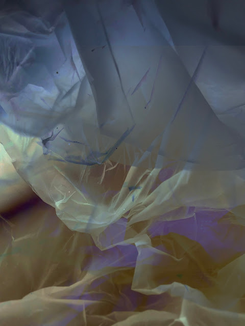
For my Final images i had decided to focus on still life. I have all my images on a USB. But these are the Unedited and edited final images.

 As i said in my previous blog post, i became very interested in using the theme of still life. I like it because it gives an insight into how i, and other people, see objects.

Alison watt

I wanted to reference Alison Watt, as my images reminded me of her work I had looked at in my painting unit. I think its better to look at other inspirations outside photography and photographers when taking images. 

If you want to design a kettle, don't look at other kettles...


 I think her work is a good example of how people see things differently. I have always thought her work feels very feminine. I can see a resembelence to a vagina.  


I also came across a photographer called Vilde Rolfsen. He uses lights to photograph plastic bags, making them appear like abstracted landscapes.


I have always been interested in the beauty of things considered rubbish or unattractive. I can always see so much more in an object than i feel other people do, and i am sure they see more in an object than i do. Trying to capture that through photography is something that i find very difficult at times, but interesting.

I started looking at objects and trying to capture the beauty i saw in them. I eventually ended up taking images of bags as i was interested in how the camera can pick up the textures of the bag and i found it worked really well when placed them on a light box.


I then took these images and for my final 10 i decided to lay them over each other to try and create something that the viewer might not initially see as a bag but see abstracted forms and colours that would appear attractive but is actually just a bag that would be thrown away. 


I am happy with my final images and i think they work with the theme of the unit.

I just enjoyed taking these images, i enjoy photography and i think i find it so easy to get bogged down and stressed out that i forget sometimes to find the joy in what i do and forget that making art is what makes me most happy.


Comments

Popular posts from this blog

Alice Potter

. Digital Media . Illustration . Surface Pattern . Alice Potter   I decided to start my research with Alice Potter. I was interested in Alice Potter's work because it is very different to what i usually look at.  Potter is a London based freelance illustrator and children's wear print designer. Design is something i am not sure i have an eye for, i do appreciate it but i don't tend to find myself attracted to it, or give it as much thought as i probably should. http://alicepotter.co.uk https://www.etsy.com/uk/shop/AlicePotter I love the colours in this one above, i like how simple it is, but it still translates as an apple. I like the dot print i think it adds a kind of sweetness to the design as well as add something to the flatness of it. I really like these, i love how happy they look because of the use of colour.  Potter draws her work out in her sketch book and then moves onto illustrator where she uses the pen ...

Typography Investagation.

We have started a new unit, typeface and letterforms. I found this very daunting, because, it is a completely new, huge world to me that i have never explored... We watched a film about Helvetica and it was very interesting but like i said i feel really overwhelmed. I wanted to know what happened before more in depth and really look into it as best i could. I decided to calm my nerves by looking into the history of type face, and to, i guess start at the beginning... for myself. while researching i found out that a lot of people agree that the creator of typography was a German man named Johannes Gutenberg. But before he came along books needed to be scribed, by hand. Obviously this was very time consuming, So Guttenberg created Blackletter. I think this was modeled after the scribe's. It has thick vertical lines, and thin horizontal connectors. This was hard for printing, as it looked very dense and squished together. So then came Roman Type, the first roman type was cr...

Art & Design Portfolio - Sam Cornwell (Digital)

I decided to start my research on paper based and digital portfolios by first looking at a digital portfolio. One artist who came into the college to do a talk was a photographer called Sam Cornwell, he took us through his digital portfolio. I wanted to think about why his portfolio was digital and not paper based. One of the biggest advantages of a digital portfolio is the accessibility of it. It is easy to send out to employers or people wishing to view it. It is digital so it can easily be send to someone via email or put on a USB and accessed that way. Another reason is unlike a paper based portfolio there is more than one, it is easy to dispatch without spending money on paper to print. It is also instant, you might have to wait a few days for a paper port folio to be sent by mail or spend money on travel to bring it to the person wishing to view it. With a digital portfolio one click and it is sent! I went onto Sam Cornwell's page and found out his portfolio is on his web...