Cubism was created by Pablo Picasso and Georges Braques between 1907 - 1914. It is considered one of the most influential art movements.

Cubism Was hugely inspired by the works on Cezanne using the idea that images could be created to show multiple view points by breaking down objects back to there geometric parts. Unlike art movements previous to it, Cubist painters rejected the idea that art should copy nature. They wanted instead to highlight the two-dimensionality of the canvas, so they reduced and split objects. It was conceived as ‘a new way of representing the world’ and at the time, it was. It opened up new possibilities for artists as it was seen as a revolutionary approach in viewing the world, and how it could be expressed visually. It is deemed now, as the first style of “abstract” art.
Cubism began Paris in 1907/1908. It was created by Georges Braque and Pablo Picasso; Cubism became one of the most influence styles in the 20th century.
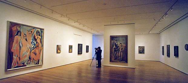
It is generally agreed that cubism started with Pablo Picasso’s celebrated painting 'Les Demoiselles D’Avignon'.


This large oil painting was made in 1907, and shows five nude female prostitutes. This painting shows Picasso's shift from classic perspective and traditional European painting to an early form of the cubism style. At the time Les Demoiselles was very controversial.
Although this is an important step to cubism, the movement actually acquired its name from the art critic Louis Vauxcelles, when he commented on one of Georges Braque’s paintings, being exhibited in Paris in 1908, describing it as reducing everything to ‘geometric outlines, to cubes’.
Georges Braque's painting is of a bottle, fish and plate on a table with a drawer looks very busy, fractured and broken. I know that Analytical cubism used colours like blacks, blues and greys and i can see it in this painting,I don't see a lot tonal changes. Analytical cubism paintings appeared very muted with dark tones.
Another good example of the Analytical phase is:
This painting is by Juan Gris, he was a Spanish painter who's works were very distinctive in the cubism movement.
This is a good example of Synthetic Cubism because Picasso put together, or 'synthesised', areas of colour and texture to give the impression of recognizable objects.The shapes and colours are balanced to maintain the appearance of flatness.I noticed the strong flat colours as well as texture that i found out was grains of sand.

Cubism Was hugely inspired by the works on Cezanne using the idea that images could be created to show multiple view points by breaking down objects back to there geometric parts. Unlike art movements previous to it, Cubist painters rejected the idea that art should copy nature. They wanted instead to highlight the two-dimensionality of the canvas, so they reduced and split objects. It was conceived as ‘a new way of representing the world’ and at the time, it was. It opened up new possibilities for artists as it was seen as a revolutionary approach in viewing the world, and how it could be expressed visually. It is deemed now, as the first style of “abstract” art.
Cubism began Paris in 1907/1908. It was created by Georges Braque and Pablo Picasso; Cubism became one of the most influence styles in the 20th century.
It is generally agreed that cubism started with Pablo Picasso’s celebrated painting 'Les Demoiselles D’Avignon'.

This large oil painting was made in 1907, and shows five nude female prostitutes. This painting shows Picasso's shift from classic perspective and traditional European painting to an early form of the cubism style. At the time Les Demoiselles was very controversial.
Although this is an important step to cubism, the movement actually acquired its name from the art critic Louis Vauxcelles, when he commented on one of Georges Braque’s paintings, being exhibited in Paris in 1908, describing it as reducing everything to ‘geometric outlines, to cubes’.
Cubism had two distinctive phases.The Analytical Phase (1907-12) and The The Synthetic Phase (1913 through the 1920s).
The name Analytical suggests analysis, the close examination of a subjects in order to create flat shapes, lines and angles and overlapping planes.
 |
| Georges Braque Bottle and Fishes circa 1910-2 Oil on canvas |
Georges Braque's painting is of a bottle, fish and plate on a table with a drawer looks very busy, fractured and broken. I know that Analytical cubism used colours like blacks, blues and greys and i can see it in this painting,I don't see a lot tonal changes. Analytical cubism paintings appeared very muted with dark tones.
Another good example of the Analytical phase is:
 |
| Juan Gris bottles and knife-1911 Oil on canvas |
With the objects appearing broken down i get a sense of simplicity in this painting. I also really enjoy how the brush strokes are very dramatic but show some control.
The synthetic phase in Cubism was composed of fewer, simpler forms in brighter colours. Collage was used with paint. I find this phase very Interesting because instead of close examination of an object, they would actually make things as simple as they could, breaking down an object to its simplest form.
 |
| Pablo Picasso Bowl of Fruit, Violin and Bottle 1914 Oil on canvas |
This is a good example of Synthetic Cubism because Picasso put together, or 'synthesised', areas of colour and texture to give the impression of recognizable objects.The shapes and colours are balanced to maintain the appearance of flatness.I noticed the strong flat colours as well as texture that i found out was grains of sand.
It is always good to look at what was going on in the world during the same time as an art movement, to see influences and understand works more.

They were both inspired by Jules Henri Poincaré, a French mathematician, theoretical physicist, engineer, and philosopher of science, his suggestive play with higher dimensions was a big inspiration on Picasso's discovery of geometry, and how this could be portrayed in his art, Poincaré's insights on time and simultaneity were inspirational to Einstein's discovery of relativity.
In 1905, science had made huge discoveries. Art and science have always had such an interesting relationship, so it is not hard that Picasso and Einstein believed that art and science are means for exploring worlds beyond perceptions or beyond appearances. Although Albert Einstein and Picasso have no evidence of a connection, i believe their work is very connected.
At the same time that Picasso was discovering cubism, the basic idea of capturing an object from all angles, in one image. Einstein was discovering his theory of relativity.

They were both inspired by Jules Henri Poincaré, a French mathematician, theoretical physicist, engineer, and philosopher of science, his suggestive play with higher dimensions was a big inspiration on Picasso's discovery of geometry, and how this could be portrayed in his art, Poincaré's insights on time and simultaneity were inspirational to Einstein's discovery of relativity.
I think people struggle to understand cubism, and because of this, do not find a connection with it ,but, it truly was a revolutionary style of modern art and was completely revolutionary in the visual arts, It gave artist the freedom to explore and create in a way like never before and the effects it created later in fashion, household appliances, furniture, advertisement, Buildings, signage, sculptors, posters, television, film and more, have been huge, so much so, in fact that we hardly notice them.
Comments
Post a Comment