
PRINTMAKING - Norman Ackroyd


Norman Ackroyd is an English artists,based in London, known for his aquatint work, a variant of etching.


I have always thought that landscape paintings, prints and photographs are very difficult to do. I have often thought that what makes a landscape beautiful is our eyes ability to focus on multiple points and the fact it is surrounding us. Being from the Borders of Scotland i see a lot of landscape inspired work... and skill to capture a landscape as the eye see's it has never been something i have found visually stimulating.

Norman Ackroyd's prints are something else...

The Rumblings Muckle Flugga Shetland - 2013
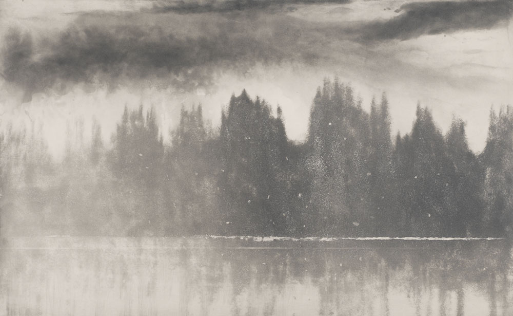
Loch-Awe-in-Winter-2006
Autumn-Sunrise,-Windermere-1998
Loch-Broom-from-Achiltibuie-(1993)
I love how some of these are just impressions of a shape that suggest a hill or a reflection. They are how, i would say, it feels to look at a landscape. There is something about them that envelopes me when i look at them.

As etchings i am blown away by how smooth they are. Obviously i am have a lot to learn about etchings, when i make etchings they rarely look smooth, you can tell i have used cross hatching and you can sense hoe rough the plate was. But learning different techniques takes time and experimenting.

Comments

Popular posts from this blog

Alice Potter

. Digital Media . Illustration . Surface Pattern . Alice Potter   I decided to start my research with Alice Potter. I was interested in Alice Potter's work because it is very different to what i usually look at.  Potter is a London based freelance illustrator and children's wear print designer. Design is something i am not sure i have an eye for, i do appreciate it but i don't tend to find myself attracted to it, or give it as much thought as i probably should. http://alicepotter.co.uk https://www.etsy.com/uk/shop/AlicePotter I love the colours in this one above, i like how simple it is, but it still translates as an apple. I like the dot print i think it adds a kind of sweetness to the design as well as add something to the flatness of it. I really like these, i love how happy they look because of the use of colour.  Potter draws her work out in her sketch book and then moves onto illustrator where she uses the pen ...

Typography Investagation.

We have started a new unit, typeface and letterforms. I found this very daunting, because, it is a completely new, huge world to me that i have never explored... We watched a film about Helvetica and it was very interesting but like i said i feel really overwhelmed. I wanted to know what happened before more in depth and really look into it as best i could. I decided to calm my nerves by looking into the history of type face, and to, i guess start at the beginning... for myself. while researching i found out that a lot of people agree that the creator of typography was a German man named Johannes Gutenberg. But before he came along books needed to be scribed, by hand. Obviously this was very time consuming, So Guttenberg created Blackletter. I think this was modeled after the scribe's. It has thick vertical lines, and thin horizontal connectors. This was hard for printing, as it looked very dense and squished together. So then came Roman Type, the first roman type was cr...

Photography : Rommert Boonstra & Laurie Simmons

For photography i wanted to look at artists who use models or staged worlds for their photography because its not something i looked into previous years. From moodel i came across Rommert Boonstra. He is a photographer, poet and theater director. He also taught photography at several art academies.He is well known for his Staged photography and he has Four books are published about his photo works. He uses everyday objects to create these worlds... I am pretty taken aback with these photographs and i am surprised there is not a lot about these images online. The only words i can find to describe them is other worldly. They look like completely different words, like something you would find in science fiction comic. They are just amazing. What i liked about these is the way he has used light and shadows to create the illusion of above and below, in the first 2. He has also used composition and perspective to make you feel like you are inside the world its self. I like...