Conduct market research into the range of publications available for the target age group. Free and for sale. Contemporary and historical sources - visual and non - visual.
I wanted to start my research with a range of publications.
At this point i am unsure where i am going / what i want to do so i thought i would just start with exploring a wide range of publications as the brief says to try and find my interest. I started with a well known magazine that 18 - 30 year olds would look at, i thought about interests and started with fashion.
Vogue

I liked this cover above because it is very minimal, and i think that is more stylish and clean looking. I like the black and white look and the muted tones in it, like the title 'Vogue' i think works really well with the black and white. The magazine usually has more type in it....

I thought this was a good example of what an issue of vogue usually looks like, it is still quite minimal and looks very 'classy' but there is a lot more going on in this issue. Again i like the use of colour, the greys and the pastel pink i think are really visually pleasing. I think high fashion magazines are always very clean looking. They tend to use colours that match the cover image and colour schemes that are "in" at the time.
I wanted to go down to the library and have a look at vogue as a physical magazines and see the centre spreads and the lay outs of the magazines...
inside vouge:


Again, like the cover it is very minimal and i would say clean looking. I think for me, i would not do a magazine in this way, because i don't think it reflects me as a person although, i do think the design of them is very nice looking.


I like, again how minimal the cover is, i like the red border and the red title with the serif type. It is a more serious magazine, and it looks that way as soon as you see it, you can tell it is about current news events, people and political subjects. I really like how minimal the cover is, and i think i would want to do something like that for my magazine. I really like the way the centre page is layed out, i think the heading "how the right went wrong" is really eye catching and i think it works with the bold heading, the type and the image.


I thought it was something to think about and remember when it comes to developing ideas in my own magazine. I wanted to also remember a few things with visuals.

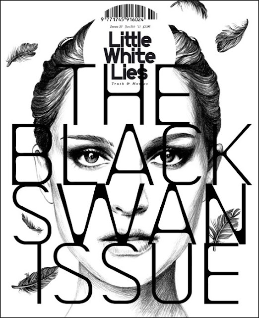
Like this issue for example of Little White Lies. I also like the combination of the type over the image.


Both of these magazines use collage, i think this is really different and would catch my eye if i was passing, i like the idea of having an image revealing the other image... and i know i want to use something like that for my magazine combining my body painting.


I also need to keep in mind colour, pattern and use of type.At this point i started thinking about my interests, what i know, what i am interested in and what i want to create. I don't want to do something digital, or fully digital....
I wanted to create something that expressed me... and was about something i think is important so I made a mind map in my sketch book.
I decided I wanted to create something hand made, I wanted to make it small, and fold out into a broad sheet. Something that is seen as a small problem, or something that is over looked / covered up.
I thought about this idea and decided to do something about physical, emotional or sexual abuse. I thought about how I could do this, how the front cover would look, and what I wanted to do to express the idea of it being a "small issue" or something that is over looked, covered up or made to look like a small problem.
I started looking at ways to fold up paper.

This made me think about my "magazine". Could i do something that is folded up and then when opened that is my centre spread? that way i could use an image to reveal another image underneath
(covering up).
Then I thought about using origami, paper folding or a paper chain. I thought this is a good way of capturing innocence or the idea that something looks ok on the outside but inside there is so much to it.
So i decided to look at leaflets and alternative ways people have used paper folding to create a magazine or poster.

I really liked this idea! i thought it was so effective and such a different way to have a magazine. I kept looking around and i found this idea:

I wanted to go down to the library and have a look at vogue as a physical magazines and see the centre spreads and the lay outs of the magazines...
inside vouge:


Again, like the cover it is very minimal and i would say clean looking. I think for me, i would not do a magazine in this way, because i don't think it reflects me as a person although, i do think the design of them is very nice looking.


Time Magazine


Kerrang Magazine


Kerrang magazine is aimed at younger people, who like current alternative music. It is the opposite of the other magazines i have been looking at because the cover of this magazine is all over the place, headings everywhere loads of type and the image is usually over lapping the name of the magazine. Although it is pretty "messy" i think it works with that alternative image, and must have had some sort of inspiration from what i learned about Ray Gun and David Carson with the "cut out" type and the way that was adapted and used for album covers i feel a connection to that BUT in the same breath it reminds me of a gossip magazine with the layout and the way the type is all different and all over the place.
The inside of the magazine i REALLY like, i love the way they have used matching colour for the image and headings, the second image they have taken colour from the person in the image's hair and t-shirt, showing how important the whole process of designing the centre page is. The first image i thought it was very interesting that the image and text are merged together, and the type is moving around the guitar.
It made me think about the shape of text, how it can be laid out and how it can be wrapped around an image or placed in a different way, for example:


Hand drawn and combining digital and hand made work.

Yorokubu.
This magazine cover used a overlaid a pencil illustration of lips with letters drawn in lipstick and repeated the pattern four times, each with a different letter, something to think about but also i want to remember using digital work as well, as that combination i think works very well!

Like this issue for example of Little White Lies. I also like the combination of the type over the image.
Collage


Both of these magazines use collage, i think this is really different and would catch my eye if i was passing, i like the idea of having an image revealing the other image... and i know i want to use something like that for my magazine combining my body painting.
Pattern and use of Type


I also need to keep in mind colour, pattern and use of type.At this point i started thinking about my interests, what i know, what i am interested in and what i want to create. I don't want to do something digital, or fully digital....
I wanted to create something that expressed me... and was about something i think is important so I made a mind map in my sketch book.
What do i wanna do?
I decided I wanted to create something hand made, I wanted to make it small, and fold out into a broad sheet. Something that is seen as a small problem, or something that is over looked / covered up.
I thought about this idea and decided to do something about physical, emotional or sexual abuse. I thought about how I could do this, how the front cover would look, and what I wanted to do to express the idea of it being a "small issue" or something that is over looked, covered up or made to look like a small problem.
I started looking at ways to fold up paper.

This made me think about my "magazine". Could i do something that is folded up and then when opened that is my centre spread? that way i could use an image to reveal another image underneath
(covering up).
Then I thought about using origami, paper folding or a paper chain. I thought this is a good way of capturing innocence or the idea that something looks ok on the outside but inside there is so much to it.
This way i could come up an idea then go back to looking at magazines layout, colour and how i wanted it to look.
So i decided to look at leaflets and alternative ways people have used paper folding to create a magazine or poster.
I really liked this idea! i thought it was so effective and such a different way to have a magazine. I kept looking around and i found this idea:
I really liked the way it folded together to make the front image ! and i decided to start trying out different ways to fold paper and then take it from there.
Some great observations here, amazing how much fantastic design is out there ! So much visual noise it is overwhelming at times.
ReplyDeletereally strong considered research!
ReplyDelete