I wanted to start by looking at hand made covers or images, these are in my sketch book. i started with this image that i then photo copied and did a repeat pattern then painted on top of it.

I then took the image and used an over lay of a paint texture over it to try and express the same idea i had with the physical paint.

 As an experiment i like it, maybe not the actual imagery but the idea of using both to make imagery. I then decided to make a simple collage and photograph it then work on it digitally... I wanted to keep my theme of abuse in mind so i cut the photograph to resemble something broken, separated or fractured.
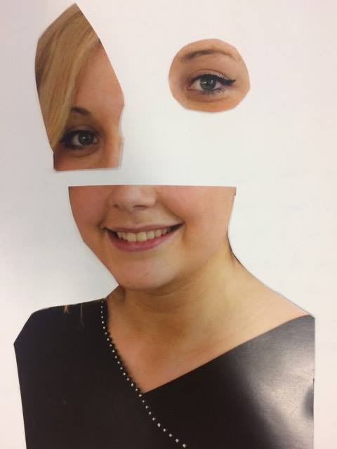


 I really liked the eye in the right hand corner, i wanted to go back to the idea of a repeat patten, mainly because i was having fun playing around with digital collage and i really enjoy using typography in this way...


I then went back to my sketch book to play around with more physical collage, i also want to print some of these images and use them. Will update my blog as i do more with these ideas.

I then took the image and used an over lay of a paint texture over it to try and express the same idea i had with the physical paint.

I liked the contrast of physical and digital, but i wanted to clean it up a little in the cross separation.


This was the image i started with, very simple. I played around with this image a few times. I wanted to look at colour, message and type.


This first images i wanted to look more feminine feel to it, i liked the circular shapes and i thought the image was interesting, but i wanted it to have a darker feel...

I decided i would go with a darker feel, i tried to think about abuse and the way it makes leaves your mental state... Lost, confused, broken and distorted. I liked this image and decided to take it further and play with it more... With the type, i wanted to remember what i looked at in my typography unit...


I then went back to my sketch book to play around with more physical collage, i also want to print some of these images and use them. Will update my blog as i do more with these ideas.
Comments
Post a Comment