For my painting unit i have been looking at the subconscious mind, what is behind the scenes of the subconscious mind?
While i have been working on this unit, i have been documenting my dreams in a small book, and while i have been creating images from my dreams using colour, shape and mood i have had a running theme on all my dreams, its something i have had since i was very young. Nightmares.
I am obsessed with horror, fear and the psychology behind what is perceived as scary. Because of this fascination i read, watch and listen to everything horror related, almost everyday. So much so, in fact that i am completely desensitised to it, i have nightmares but they are not really scary in fact they are in some ways very beautiful... to me. In my "nightmares" what i am doing, or what is happening is scary but i do not feel the fear... in fact i do not really understand why it is scary until i wake up and analyse it.1
In some ways what i am doing is scary but the end result is not, for example...
In one dream i was seeing a woman peeling her skin off, this should have been scary but in the dream i was fascinated.... under her skin was beautiful colours and streams of gold lines.
As a person i think i see the beauty in most things, i choose to be a positive person, i am fascinated with the world, especially the dark side of human nature and what other people feel and think and a happy person and although a lot of people don't like that, its who i am.
With this in mind i thought this dream was quite fitting to who i am, and how i see the world and how my mind processes things.
I want to capture the beauty i see in my mind... but how?
I have been experimenting with painting my feelings and thought and how i can capture them, in ways i find it easier to express these things in others more than myself but i like the raw truth to this, it is literally how i see the world and how i feel! The colours are my feelings and the lines of gold are my thoughts.
( i have all this in a dream journal attached to my sketch book )
So i started experimenting with this idea, firstly on paper i painted ideas of these colours and golden lines:


I choose water colour for two reasons, the first being the fluidity of it, the way it feels almost dream like and secondly because using a wet on wet technique i felt captures the way the colours under the skin looked in the dream.
I decided to then try it on skin before i created a full image, just a few experiments and planning out ...


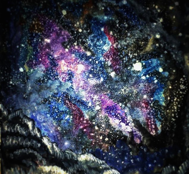
unfortunately this did not work how i imagined it, i was quite sad about the paint not working wet on wet on the skin so i thought i would re think what to do, i went back to my little dream book and found a running theme, water and space so i decided to try out a theme of space or blackness...
these are some of the paintings i created before:

and then decided to try it on skin, i used a class mate and tried it out:


Although i like these i don't think they express what i wanted, the beauty i find in my dream, the horror and the beauty, so, again i went back to my book. I didn't find anything i really wanted to take further and started to feel a bit lost...
BUT THEN
I had a dream i would really like to take forward, i dream i was walking up to a woman lying on the ground, she was covered in cuts and gashes and as i looked closely at her ( again not scared more curious) i saw a little colour, i pulled back her skin a little and under it was flowers, the more i pulled the more flowers came out! I decided to experiment!
I felt this was perfect because to me the world is beautifully horrific. And my mind sees this in my dreams, the beauty i see in the horrible things...


I decided to then try it on skin before i created a full image, just a few experiments and planning out ...


unfortunately this did not work how i imagined it, i was quite sad about the paint not working wet on wet on the skin so i thought i would re think what to do, i went back to my little dream book and found a running theme, water and space so i decided to try out a theme of space or blackness...
these are some of the paintings i created before:
and then decided to try it on skin, i used a class mate and tried it out:


Although i like these i don't think they express what i wanted, the beauty i find in my dream, the horror and the beauty, so, again i went back to my book. I didn't find anything i really wanted to take further and started to feel a bit lost...
BUT THEN
I had a dream i would really like to take forward, i dream i was walking up to a woman lying on the ground, she was covered in cuts and gashes and as i looked closely at her ( again not scared more curious) i saw a little colour, i pulled back her skin a little and under it was flowers, the more i pulled the more flowers came out! I decided to experiment!
I felt this was perfect because to me the world is beautifully horrific. And my mind sees this in my dreams, the beauty i see in the horrible things...


FUCK !!
Again....
this did not work, it wasn't what i wanted.But I wanted to stick with the idea.
I am starting to realise the importance of experiments and the role they play in my
work. The process and that it is OK that not everything I create
works/ is good. It's about the process...
I went back right to when I
started creating special effects I decided to try again with cotton
wool... this again, I am realising he importance of documenting my
work for later reference... it's funny how I have learned so Much Yet
I find myself looking back to when I started.
I first tried out ideas on my arm ...


I first tried out ideas on my arm ...


YES!
I felt like i was starting to get somewhere!
Cotton wool resembles the way skin rips much more than toilet roll, as it is much easier to manipulate, so i decided to try and incorporate that.


I wanted to do another on the arms, at first i liked the idea of having a flower in the hand...


I felt like i was starting to get somewhere!
Cotton wool resembles the way skin rips much more than toilet roll, as it is much easier to manipulate, so i decided to try and incorporate that.


YES
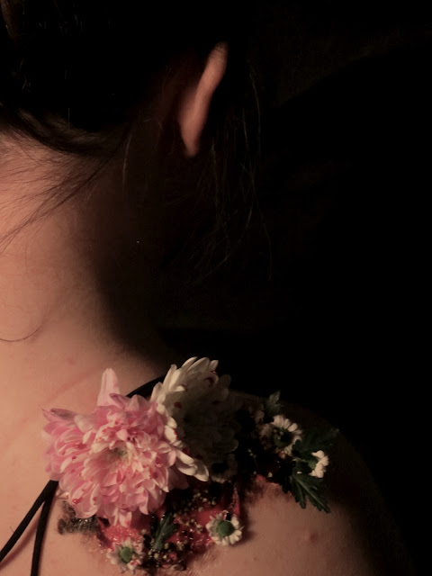
I really liked these and i wanted to try and take it further maybe produce 3 images with different body parts so i tried the shoulder this was a much easier because it is much tighter skin i wanted the flowers to be bigger and a bit more extreme than the ones above...


I tried to keep the lighting soft because i wanted to have the face unseen, but partial... i liked the idea of stripping away the identity of the person in the image.


I felt this was to much red so i tried it without the flowers...

I didn't want it to the the whole hand, i wanted it to be partial like a dream...

These 4 images i decided to experiment further with:


I then wanted to bring back the physicality of the paint so i then did over painting on photos, small ones to experiment...


I really liked the idea of taking away identity

I decided to keep experimenting in my sketch book, making the paint look more fluid. I then got the images printed off large scale, not as large as i wanted but A3 so i am going to be taking them forward.
I have learned a lot doing these and doing this unit, i think that i took ownership of this work, its something i struggled with before when making work. I feel like i really found myself in this unit and actually did something i loved. It got stressful but i kept going, i really enjoyed and fully appreciated the process... i am nervous and excited to see the finished results. I think if i had longer i would have kept going and kept producing images.
Comments
Post a Comment