For my new unit, i have decided to look at film. I was unsure of how to start this so i thought to myself what is film? It is a series of moving images. 

I decided to start at the beginning, literally. 

The Horse in Motion

Horse in motion is considered the first film, a man named Eadweard Muybridge set up cameras to try and capture images of a horse to prove if all 4 hooves came off the ground at one point in its galloping sequence. He set up wires to trigger the cameras to take the photo along a race track. 


I decided to give this a go for myself i started by taking a photo on my phone using the burst setting to capture a class mate walking. 


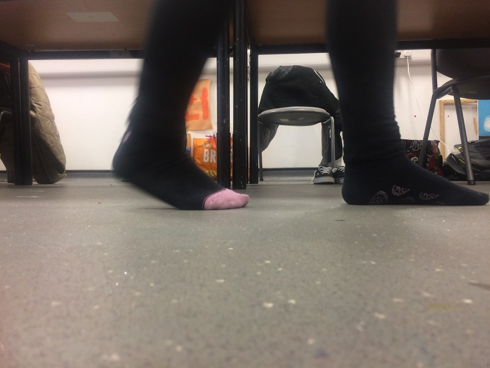
I then put it on the computer and tapped through them to see it in motion. 


I actually tried my hand at this before in some stop frame experimenting by drawing each scene or making models and moving the between frames.


My next plan is to look at different techniques, or how it can be used in art, i am going to look at artist who use film and progress from there. I feel starting it like this helps, because i just needed to make a start somewhere to get the ball rolling! 


http://www.tate.org.uk/whats-on/tate-britain/exhibition/eadweard-muybridge/exhibition-guide/horse-motion


Comments

Popular posts from this blog

...

When i was a kid, i got asked to produce a drawing that expressed Autumn, the winner got the work in a calendar for the school. I worked and i worked on this drawing, expressing my feelings of Autumn. I won. I told my Mum and Dad that they could buy the calendar with my work in it, i was so proud. I showed my parents my work, and although they were happy for me told me they that although it was good, my sister's new drawing of a bird was better... more realistic. Through out all of my childhood and teenage years, i was told i was not as good as my sister and to this day i still do. I would constantly compare my work to hers, and eventually i gave up art completely. I had a pang of jealousy when i would see other peoples art work, and suppress the jealous feeling towards my sister and the anger i felt towards my parents. I felt even more guilt and as i grew i built up this wall around myself, i put on a mask of a confident girl, who did not feel jealousy, sadness or frustrat

Dada Collage part 2

I released i was trying to copy Hannah Hoch's    Das Schone Madchen/ beautiful girl collage instead of understanding it so i decided to research the artists and this peace of work i found out this is a photomontage made in the 1920's that deals with gender issues amidst the dawning of Germany’s New Woman. the hair and womans body is looking at beauty trends and expectations in women of that time and the Car parts are contrasting with the way society looks at women, even today. I started noting similarities in what i felt Hoch was trying to say was the modern women in the 20's and what is a modern woman today. trying to keep similar colours and tone, i chose a modern day hair style as well as a measuring tape and lipstick to suggest modern day female beauty standards, i chose the black and white woman at the top for minimalism but put the iconic 2015 brows over the top, i kept the BMW badge but c hanged it to the 2015 one as i felt their is still an association with

View point Task 1.

Conduct market research into the range of publications available for the target age group . Free and for sale. Contemporary and historical sources - visual and non - visual.  I wanted to start my research with a range of publications. At this point i am unsure where i am going / what i want to do so i thought i would just start with exploring a wide range of publications as the brief says to try and find my interest. I started with a well known magazine that 18 - 30 year olds would look at, i thought about interests and started with fashion.  Vogue  I liked this cover above because it is very minimal, and i think that is more stylish and clean looking. I like the black and white look and the muted tones in it, like the title 'Vogue' i think works really well with the black and white. The magazine usually has more type in it.... I thought this was a good example of what an issue of vogue usually looks like, it is still quite minimal and looks ver