so after my last post, i decided to try out a different technique. i decided to look at Jackson Pollock, and it really inspired me to create. I started by thinning out some paint & just experimenting...
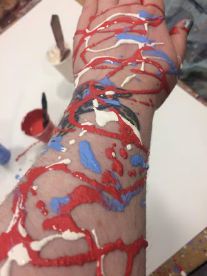
I really liked how it came out, it really helped me remove some negative thoughts from my mind & put them on paper... but i wanted to keep going, to try and create something with meaning... one of my units theme is 'behind the scenes' i decided to look at behind the scenes of myself, starting with my blog post, and why i put myself down, what goes on in my mind behind my confident shell. I thought about colour & marks. HOW DO I FEEL?
Angry - red - movement
sad - grey - blobs
in denial about it? - white- swirls
simple but i thought i would try...
After my summer holidays i started logging my dreams and once you write them down, you don't forget them. I had a dream the other night that i was in water, and i floated up and came out of a bath, of black water, i stood up and i was in a clinically white bathroom, i stepped out the bath and looked in the mirror, and i was completely black, as if i had been swimming in ink or oil, and my eyes were completely black, i opened the door and walked down the hall, where i saw a mirror image of myself except i was completely white, in a black room, everything i touched left a black mark on the white, and my mirror image would leave a white mark on the black in the reflection !
This made me decided on my theme for my painting unit, i am going to choose "behind the scenes" and look at the scenes of my subconscious mind! so i began.
I wanted to really capture movement & energy...
But i still felt a disconnect.... it needed to be more.... ME. but how??
I loved how this felt! it was so much fun to play around with the paint, but i wanted to really look at the black and white image as that was what my dream was really about... i wanted to try and create something like that... so again, i started experimenting...
I liked the white on black but i needed it to be more... fluid the marks needed to be looser so i thinned out the paint more
I plan on turning them into a head and shoulders, or full body painting, and see where that takes me, i want to do the same but black over white and then do something with both images.
I am so excited to see where this goes! i feel like i am onto something.


Love it cat.. Hand looks great
ReplyDelete