Continuing with my unit on photography in my area, using reflections, I wanted to try and use a broken mirror to reflect buildings and areas of Peebles that i liked. I started at the cross kirk and tryed to reflect it in a different and maybe more abstract way. My laptop charger broke yesterday and I am waiting for a new one to arrive (sigh) so I thought this would be a good time to try out editing photos on my phone, using apps and the editing tools already on my phone.

 The first image is the original, I didn't need to crop this because when I took it I used the grid on my camera, to avoid cropping. This was very handy because it helped me understand composition a bit more. I did crop it a little to see how it would look also to help me understand composition. I added a blue hue to the second image and I think it gives it a a different mood.


 These edits are using Instagram filters and playing with contrast and temperature.

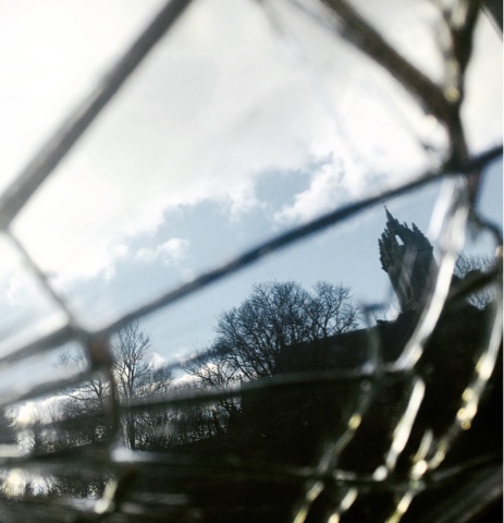
 In this image I wanted to look at the focus on my camera, the first one the focas is on the cracks in the mirror and the second is on the actual reflection. I like them both but I think the second image works better for the unit it is for. I still think this is interesting and also helps with my other unit in experimenting with photography.


I really like this idea and I think it works well. It gives the photo a little more mystery and wonder I think. I prefer the first two images in black and white, because I think it captures what I am trying to do a bit better than the third.


Some of these did not work as well as I wanted but I guess that's the point of learning. The mirror needed to be flat up against the wall for this to work.
I did the same with this photo but did not want to zoom in so much I liked the round mirror. This is a reflection of the cross kirk but I like that you can see some of the sky and I think the blue hues work well with it. I decided to try out using the round mirror
I then went back to the close ups in the mirror.
I also tryed the same with the reflection of the church and sky
I then had an idea, what if I took a section of the mirror and put it against the wall, making it look like you are looking through a gap in the wall rather than a reflection
I then tryed out different reflections around the area
Comments
Post a Comment