
Contemporary Art Evaluation

This was definitely one of my favorite units this year. I loved looking at such a wide range of artists. What i love about contemporary art is how it can say so much or nothing at all, it can be so full or so bare.

I started experimenting different techniques by looking at a few different artists like Sarah Lucas, Rachael whiteread, Julian Opie, David Carson, Damien Hirst, Yayoi Kusama and more. We started this unit by researching different artists and doing presentations in class and i really liked that because in little groups we got to look at things together.

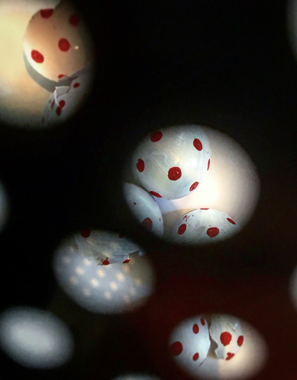
I ended up focusing on painting dots ( Kusama & Hurst) and working to the theme fragile. I ended up painting and photographing dots.


I ended up combining with shadows and the eggs to make images that  i felt expressed the idea of  confined fragility.


 I loved combining painting on something 3D and photography. The process was exciting because i got to play around so much.

I really enjoyed this unit as i said before. Again i do wish i had spent more time researching something different like sound and seeing what i could do with it.

Comments

Post a Comment

Popular posts from this blog

Alice Potter

. Digital Media . Illustration . Surface Pattern . Alice Potter   I decided to start my research with Alice Potter. I was interested in Alice Potter's work because it is very different to what i usually look at.  Potter is a London based freelance illustrator and children's wear print designer. Design is something i am not sure i have an eye for, i do appreciate it but i don't tend to find myself attracted to it, or give it as much thought as i probably should. http://alicepotter.co.uk https://www.etsy.com/uk/shop/AlicePotter I love the colours in this one above, i like how simple it is, but it still translates as an apple. I like the dot print i think it adds a kind of sweetness to the design as well as add something to the flatness of it. I really like these, i love how happy they look because of the use of colour.  Potter draws her work out in her sketch book and then moves onto illustrator where she uses the pen ...

Art & Design Portfolio - Sam Cornwell (Digital)

I decided to start my research on paper based and digital portfolios by first looking at a digital portfolio. One artist who came into the college to do a talk was a photographer called Sam Cornwell, he took us through his digital portfolio. I wanted to think about why his portfolio was digital and not paper based. One of the biggest advantages of a digital portfolio is the accessibility of it. It is easy to send out to employers or people wishing to view it. It is digital so it can easily be send to someone via email or put on a USB and accessed that way. Another reason is unlike a paper based portfolio there is more than one, it is easy to dispatch without spending money on paper to print. It is also instant, you might have to wait a few days for a paper port folio to be sent by mail or spend money on travel to bring it to the person wishing to view it. With a digital portfolio one click and it is sent! I went onto Sam Cornwell's page and found out his portfolio is on his web...

Typography Investagation.

We have started a new unit, typeface and letterforms. I found this very daunting, because, it is a completely new, huge world to me that i have never explored... We watched a film about Helvetica and it was very interesting but like i said i feel really overwhelmed. I wanted to know what happened before more in depth and really look into it as best i could. I decided to calm my nerves by looking into the history of type face, and to, i guess start at the beginning... for myself. while researching i found out that a lot of people agree that the creator of typography was a German man named Johannes Gutenberg. But before he came along books needed to be scribed, by hand. Obviously this was very time consuming, So Guttenberg created Blackletter. I think this was modeled after the scribe's. It has thick vertical lines, and thin horizontal connectors. This was hard for printing, as it looked very dense and squished together. So then came Roman Type, the first roman type was cr...