Art Deco

Art deco started in France just before WW1 but became popular all over Europe and America in the 1920's - 1940's. Art deco is a design style in decretive arts, furniture, architecture, jewellery, fashion and more. It is characterised by its geometric character. It can be seen as a successor and a reaction against art nouveau. It was inspired by Cubism, Futurism and constructivism.

Tamara de Lempicka was a polish art deco painter

Self-Portrait in the Green Bugatti

one thing to note about Tamara de Lempicka's work is how you can really see how cubism inspired her work, she called it "soft cubism". 

Another art deco artist i have been looking at is graphic designer Adolphe Mouron

Pivolo Aperitif
L' Atlantique


Looking into the links between fashion and art deco i started with Fashion.

Holly Fulton spring/summer 2011


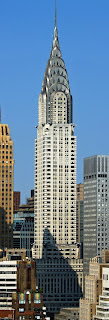
Looking at architecture i have to include the Chrysler Building in Manhattan.


The empire state building


Black & Key makes seriously chic and upscale furniture inspired by art deco


Vintage Art Deco Inspired Jewelry by Jene DeSpain


Raymond Templier was an important figure in the Art Deco jewelry movement. He was fascinated by juxtapositions of forms and the interplay of light and volume. His explorations of these themes produced some of the greatest Art Deco jewelry.


Jean and Georges Fouquet were also among the most influential designers of their time.  Their necklaces, bracelets, rings and brooches were resolutely modern in design and of imposing proportions.


http://blog.primaveragallery.com/?p=462
http://blackandkey.co.uk/
http://www.esbnyc.com/
http://www.tate.org.uk/learn/online-resources/glossary/a/art-deco
http://www.vogue.co.uk/fashion/spring-summer-2011/ready-to-wear/holly-fulton
http://www.tamara-de-lempicka.org/
http://jenedespain.com/heritage-lookbook/

Comments

Popular posts from this blog

Alice Potter

. Digital Media . Illustration . Surface Pattern . Alice Potter   I decided to start my research with Alice Potter. I was interested in Alice Potter's work because it is very different to what i usually look at.  Potter is a London based freelance illustrator and children's wear print designer. Design is something i am not sure i have an eye for, i do appreciate it but i don't tend to find myself attracted to it, or give it as much thought as i probably should. http://alicepotter.co.uk https://www.etsy.com/uk/shop/AlicePotter I love the colours in this one above, i like how simple it is, but it still translates as an apple. I like the dot print i think it adds a kind of sweetness to the design as well as add something to the flatness of it. I really like these, i love how happy they look because of the use of colour.  Potter draws her work out in her sketch book and then moves onto illustrator where she uses the pen ...

Art & Design Portfolio - Sam Cornwell (Digital)

I decided to start my research on paper based and digital portfolios by first looking at a digital portfolio. One artist who came into the college to do a talk was a photographer called Sam Cornwell, he took us through his digital portfolio. I wanted to think about why his portfolio was digital and not paper based. One of the biggest advantages of a digital portfolio is the accessibility of it. It is easy to send out to employers or people wishing to view it. It is digital so it can easily be send to someone via email or put on a USB and accessed that way. Another reason is unlike a paper based portfolio there is more than one, it is easy to dispatch without spending money on paper to print. It is also instant, you might have to wait a few days for a paper port folio to be sent by mail or spend money on travel to bring it to the person wishing to view it. With a digital portfolio one click and it is sent! I went onto Sam Cornwell's page and found out his portfolio is on his web...

Trying out Wine Glass Reflection.

I decided to look at reflection in wine glasses, i wanted to look at attractions and historical buildings. I started with the new wall mural that was painted near the high street.    I decided to play around with editing on iphoto, i boosted the contrast and played around with the filters. Another one i decided to crop a bit more to get a close up of the reflection in the glass.   I then decided to sharpen the image up making it stand it a bit more. again on iphoto.   I then moved on to the war memorial near the center of town, i wanted to capture the reflection of the shape of the building, as i found it quite an interesting shape. I decided to crop this image and use a filter on my phone just to play around with the settings on my phone, i liked the cropping but was unsure if the colours worked well in the image and thought about making it sepia or black and white, but i don't want to many black and white images. I then decide...