Another photographer i decided to look at is called Art Wolfe. Wolfe's work is a combination of Art and journalism, he graduated from the University of Washington with Bachelor’s degrees in
fine arts and art education in 1975, since then he has worked on every continent, in hundreds of locations, and on a range of different projects.
I started by looking into Wolfe's technique, i found a lot of information on the type of camera he uses (Canon’s 5DS R) and the lenses he uses - "Mostly “L” series lenses, Canon’s professional designation, the 16-35 f/2.8 L II and the 70-200 f/4 L IS. He uses extension tubes for macro work with the 70-200 and adds 1.4x extenders. But i wanted to look into his editing techniques not his equipment, although interesting and worth putting on here for future reference.
I found out Wolfe uses "Photo manipulation" in some of his photographs. Although his photographs are not heavily edited, he uses techniques like cloning the animals to fill in the gaps and make patterns out of the animals.
One of the most popular photographs is the one below that was used as the cover for his book 'migrations'.
 Critics have said that digital manipulation has no place in nature/wildlife photography. I am torn between if i agree with this or not. On one hand i don't see the problem with enhancing a photograph with editing, In nature/ wildlife photography, as long as you are not completely recreating the image and changing it completely from the original. I think it can add just a little bit more depth and attraction to the image. But also, i can see why people think this should not be done, as it is not what the wildlife actually looked like and is not documenting the true nature of the wildlife. To me, it also asks the question how far is to far when it comes to editing? and is something i will look into while exploring photography myself.
One thing i found myself asking was, is Art wolfe's intention with these images to create visually pleasing artistic photographs? or to document animals/ nature and to educate people that view them? i am not sure. Digital editing in this way would suggest that it is expressive and to be visually pleasing but dose that take away the true nature of these kinds of photography? It is something i need to think about when creating my own images further in this unit.
One project i came across of Wolfe's work was his Human canvas project. Body painting is something i really enjoy and find very interesting so i instantly found a connection to these photographs.


I can see that wolfe has abstracted the human form by using line, patterns, texture. I also like the unusual Use of the camera angles, and different view points. I have really good idea's on how to use this for my own work, as soon as i saw it i felt so inspired!
I quite like the progression you can see if Wolfe's work from the nature photography to the human canvas project, you can see how this started in his book 'Vanishing act, where he looks at how evolutionary traits benefit animals in disguising themselves from predators, I can see how the mind would then wonder over to humans and from there progress into the works above.
I am very happy i found Art wolfe's human canvas project as i have so many ideas about what i can do with my own work, i feel very inspired by these. I was first drawn to his work because of the visually stunning nature and wildlife images he produced but now i just feel so excited about the different things, i had never thought, i can do with photography. It also has taught me how photographers can progress with there work and end up with completely different images than what they started with.
I started by looking into Wolfe's technique, i found a lot of information on the type of camera he uses (Canon’s 5DS R) and the lenses he uses - "Mostly “L” series lenses, Canon’s professional designation, the 16-35 f/2.8 L II and the 70-200 f/4 L IS. He uses extension tubes for macro work with the 70-200 and adds 1.4x extenders. But i wanted to look into his editing techniques not his equipment, although interesting and worth putting on here for future reference.
I found out Wolfe uses "Photo manipulation" in some of his photographs. Although his photographs are not heavily edited, he uses techniques like cloning the animals to fill in the gaps and make patterns out of the animals.
One of the most popular photographs is the one below that was used as the cover for his book 'migrations'.

One thing i found myself asking was, is Art wolfe's intention with these images to create visually pleasing artistic photographs? or to document animals/ nature and to educate people that view them? i am not sure. Digital editing in this way would suggest that it is expressive and to be visually pleasing but dose that take away the true nature of these kinds of photography? It is something i need to think about when creating my own images further in this unit.
One project i came across of Wolfe's work was his Human canvas project. Body painting is something i really enjoy and find very interesting so i instantly found a connection to these photographs.


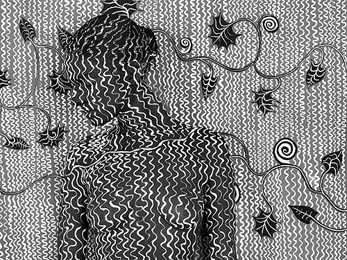

I can see that wolfe has abstracted the human form by using line, patterns, texture. I also like the unusual Use of the camera angles, and different view points. I have really good idea's on how to use this for my own work, as soon as i saw it i felt so inspired!
I quite like the progression you can see if Wolfe's work from the nature photography to the human canvas project, you can see how this started in his book 'Vanishing act, where he looks at how evolutionary traits benefit animals in disguising themselves from predators, I can see how the mind would then wonder over to humans and from there progress into the works above.
I am very happy i found Art wolfe's human canvas project as i have so many ideas about what i can do with my own work, i feel very inspired by these. I was first drawn to his work because of the visually stunning nature and wildlife images he produced but now i just feel so excited about the different things, i had never thought, i can do with photography. It also has taught me how photographers can progress with there work and end up with completely different images than what they started with.
Comments
Post a Comment