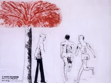
David Hockney - A rakes progress


As soon as i saw these i wanted to know what they were about! 
I found out William Hogarth produced a series of print by the same title in 1735, they told a story of the decile of 'Tom Rakewell', a man who comes to London, spends all his money on women, booze and gambling and ends up in prison and then a mental institution. 
So what are David Hockneys ones?


In David Hockneys’ prints he tell a different story of a man moving to New York, receiving money, dying his hair blonde, marrying an old maid, losing money and insted of ending up in prison, he is one of the the mindless masses of the ‘other people’, 
You can tell who the ‘rake’ is by a small arrow above his head, other than that he is just another figure... with no identity or personality. 
I read Hockney wanted to produce 25 etchings, as a book;but reduced it to 16 and printed as a series instead. 
I really like these! i think they are all very clever and each print tells a story, really has a scene in it! its like watching a play!
I love the simplicity in the lines, it works so well! i also love the use of red, i think it really grabs attention! i am glad i learned the meaning behind them before i really looked at them, other wise i would not have liked them so much i feel...

Comments

Popular posts from this blog

Alice Potter

. Digital Media . Illustration . Surface Pattern . Alice Potter   I decided to start my research with Alice Potter. I was interested in Alice Potter's work because it is very different to what i usually look at.  Potter is a London based freelance illustrator and children's wear print designer. Design is something i am not sure i have an eye for, i do appreciate it but i don't tend to find myself attracted to it, or give it as much thought as i probably should. http://alicepotter.co.uk https://www.etsy.com/uk/shop/AlicePotter I love the colours in this one above, i like how simple it is, but it still translates as an apple. I like the dot print i think it adds a kind of sweetness to the design as well as add something to the flatness of it. I really like these, i love how happy they look because of the use of colour.  Potter draws her work out in her sketch book and then moves onto illustrator where she uses the pen ...

Art & Design Portfolio - Sam Cornwell (Digital)

I decided to start my research on paper based and digital portfolios by first looking at a digital portfolio. One artist who came into the college to do a talk was a photographer called Sam Cornwell, he took us through his digital portfolio. I wanted to think about why his portfolio was digital and not paper based. One of the biggest advantages of a digital portfolio is the accessibility of it. It is easy to send out to employers or people wishing to view it. It is digital so it can easily be send to someone via email or put on a USB and accessed that way. Another reason is unlike a paper based portfolio there is more than one, it is easy to dispatch without spending money on paper to print. It is also instant, you might have to wait a few days for a paper port folio to be sent by mail or spend money on travel to bring it to the person wishing to view it. With a digital portfolio one click and it is sent! I went onto Sam Cornwell's page and found out his portfolio is on his web...

Typography Investagation.

We have started a new unit, typeface and letterforms. I found this very daunting, because, it is a completely new, huge world to me that i have never explored... We watched a film about Helvetica and it was very interesting but like i said i feel really overwhelmed. I wanted to know what happened before more in depth and really look into it as best i could. I decided to calm my nerves by looking into the history of type face, and to, i guess start at the beginning... for myself. while researching i found out that a lot of people agree that the creator of typography was a German man named Johannes Gutenberg. But before he came along books needed to be scribed, by hand. Obviously this was very time consuming, So Guttenberg created Blackletter. I think this was modeled after the scribe's. It has thick vertical lines, and thin horizontal connectors. This was hard for printing, as it looked very dense and squished together. So then came Roman Type, the first roman type was cr...