
Mounting my images!

I started off with 8 images and played around with the layout, i didn't measure them out because i was just trying to figure out how i wanted them...


The idea was that i would have a fork then full meals that were collaged then a knife and the three on another piece of mount board, the teeth then the two snacks. BUT i didn't like the knife and fork, i thought they made it look cheesy? or just not right to me... i wanted to go back to the idea of these being landscapes in a way and decided to play around with them more!


I liked these images but i changed them around, i liked that the line follows through the middle. What i liked about it was that you can flip it around and it works from all angles so i decided to move the middle image to the outside and i changed the teeth image for one of the melon.


I liked the dark and light contrast on each side so that you can see it from different angles and that contrast will always be there. I will need to mount these tomorrow as i only have one mount board.

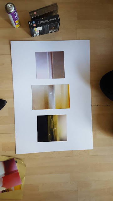
I did mount these other ones after i decided i liked the image, again i liked the line following through the middle.

Final images 

Comments

Popular posts from this blog

Art & Design Portfolio - Sam Cornwell (Digital)

I decided to start my research on paper based and digital portfolios by first looking at a digital portfolio. One artist who came into the college to do a talk was a photographer called Sam Cornwell, he took us through his digital portfolio. I wanted to think about why his portfolio was digital and not paper based. One of the biggest advantages of a digital portfolio is the accessibility of it. It is easy to send out to employers or people wishing to view it. It is digital so it can easily be send to someone via email or put on a USB and accessed that way. Another reason is unlike a paper based portfolio there is more than one, it is easy to dispatch without spending money on paper to print. It is also instant, you might have to wait a few days for a paper port folio to be sent by mail or spend money on travel to bring it to the person wishing to view it. With a digital portfolio one click and it is sent! I went onto Sam Cornwell's page and found out his portfolio is on his web...

Alice Potter

. Digital Media . Illustration . Surface Pattern . Alice Potter   I decided to start my research with Alice Potter. I was interested in Alice Potter's work because it is very different to what i usually look at.  Potter is a London based freelance illustrator and children's wear print designer. Design is something i am not sure i have an eye for, i do appreciate it but i don't tend to find myself attracted to it, or give it as much thought as i probably should. http://alicepotter.co.uk https://www.etsy.com/uk/shop/AlicePotter I love the colours in this one above, i like how simple it is, but it still translates as an apple. I like the dot print i think it adds a kind of sweetness to the design as well as add something to the flatness of it. I really like these, i love how happy they look because of the use of colour.  Potter draws her work out in her sketch book and then moves onto illustrator where she uses the pen ...

Trying out Wine Glass Reflection.

I decided to look at reflection in wine glasses, i wanted to look at attractions and historical buildings. I started with the new wall mural that was painted near the high street.    I decided to play around with editing on iphoto, i boosted the contrast and played around with the filters. Another one i decided to crop a bit more to get a close up of the reflection in the glass.   I then decided to sharpen the image up making it stand it a bit more. again on iphoto.   I then moved on to the war memorial near the center of town, i wanted to capture the reflection of the shape of the building, as i found it quite an interesting shape. I decided to crop this image and use a filter on my phone just to play around with the settings on my phone, i liked the cropping but was unsure if the colours worked well in the image and thought about making it sepia or black and white, but i don't want to many black and white images. I then decide...